


Giving Microsoft's AI Experimentation Platform a makeover
Project Overview
I redesigned ZebraAI, Microsoft's AI experimentation platform, to make prompt engineering accessible to 17,000 support engineers worldwide, not just AI experts.
Responsibility
Redesigned ZebraAI's core workflows, simplifying navigation (11→5 tabs), experiment creation (8→5 steps), and search to improve usability across 17,000 users.
Role & Team:
Lead UX Designer collaborating with 1 researcher, 1 PM, 2 engineers, and Microsoft advisors including a Principal Engineer, Data Science Manager, and UX Design Lead.
Giving Microsoft's AI Experimentation Platform a makeover
AT-A-GLANCE
I redesigned Z.AI, Microsoft's AI experimentation platform, to make prompt engineering accessible to 17,000 support engineers worldwide, not just AI experts.
SKILLS + TOOLS
Our team did user research and user testing + also utilized new vibe coding tools like Claude, Cursor and Figma Make to help the engineers
ROLE & TEAM
Lead UX Designer collaborating with 1 researcher, 1 PM, 2 engineers, and Microsoft advisors including a Principal Engineer, Data Science Manager, and UX Design Lead.
IMPACT
20 → 5 min
20 → 5
min
decrease in experiment creation time
decrease in experiment creation time
74% reduction
74% reduction
in website drop-offs
in website drop-offs
50% increase
in user satisfaction score
in user satisfaction score
OVERVIEW
Z.AI serves ~17,000 support engineers, but a frustrating UX is causing massive user drop-offs.
OVERVIEW
Z.AI serves ~17,000 support engineers, but a frustrating UX is causing massive user drop-offs.
While the underlying AI is powerful, a confusing interface makes it impossible to discover past work. Engineers and non-technical users waste time duplicating existing experiments or simply give up.
While the underlying AI is powerful, a confusing interface makes it impossible to discover past work. Engineers and non-technical users waste time duplicating existing experiments or simply give up.

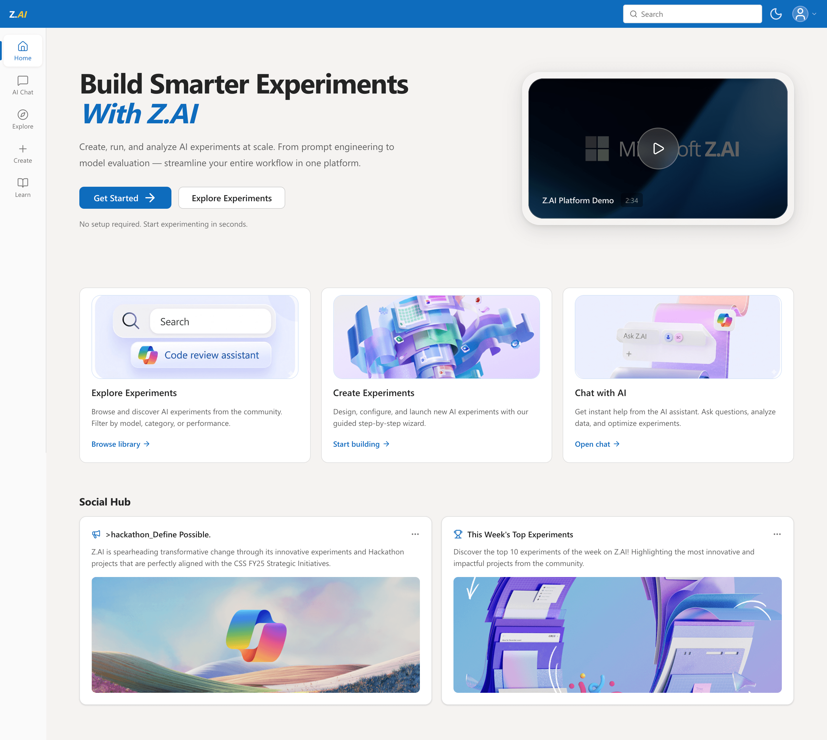
FINAL SOLUTIONS /01
A more welcoming home page
FINAL SOLUTIONS /01
A more welcoming home page
I reduced sidebar to five tabs, added a global search, and surfaced the three most important CTAs (Explore, Create, Chat). Added a Social Hub for community updates.
I reduced sidebar to five tabs, added a global search, and surfaced the three most important CTAs (Explore, Create, Chat). Added a Social Hub for community updates.

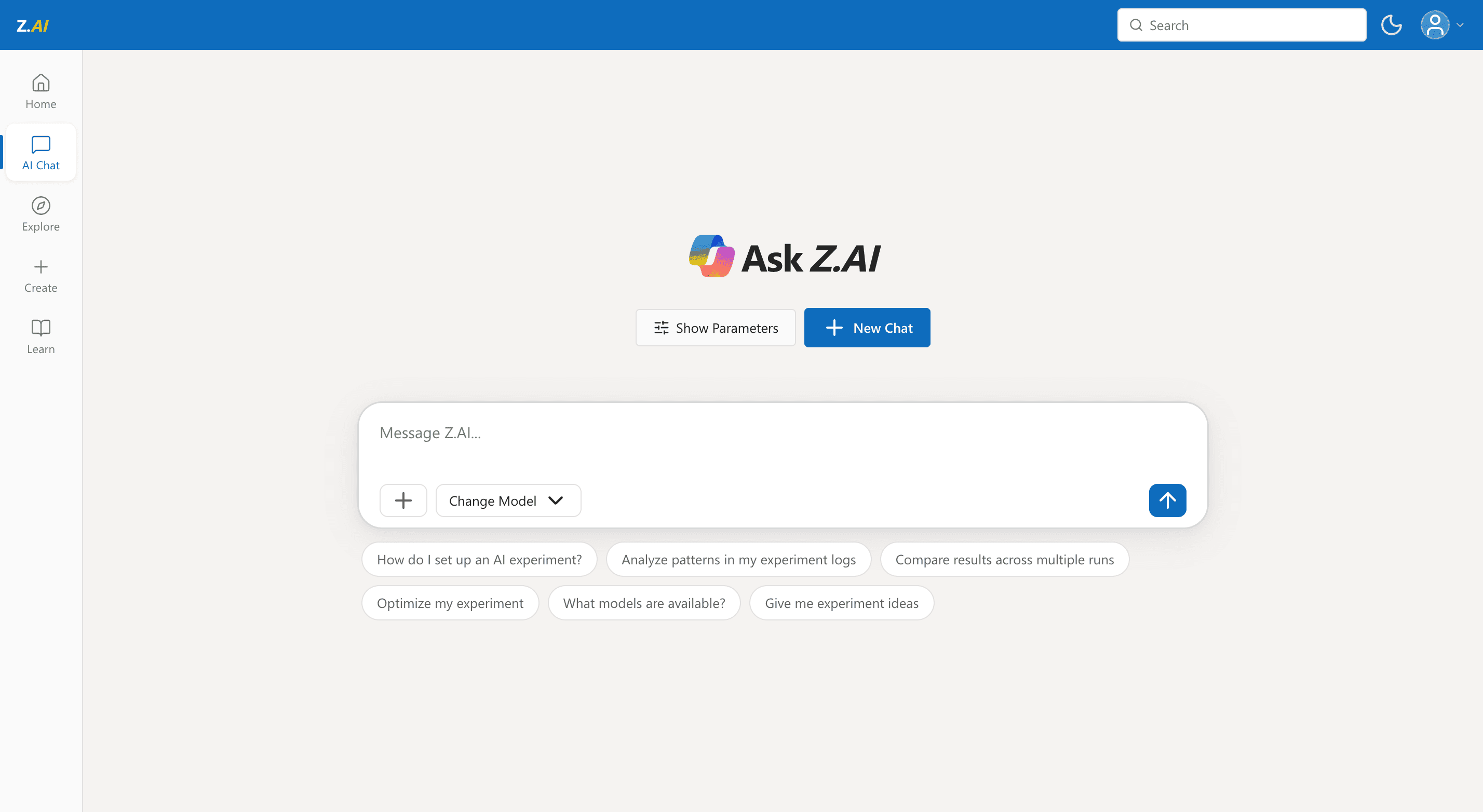
FINAL SOLUTIONS /02
An immersive AI chat experience
FINAL SOLUTIONS /02
An immersive AI chat experience
Simplified the layout and anchored the chat input to the bottom, creating a natural, conversational flow while introducing tooltips to demystify complex parameters.
Simplified the layout and anchored the chat input to the bottom, creating a natural, conversational flow while introducing tooltips to demystify complex parameters.

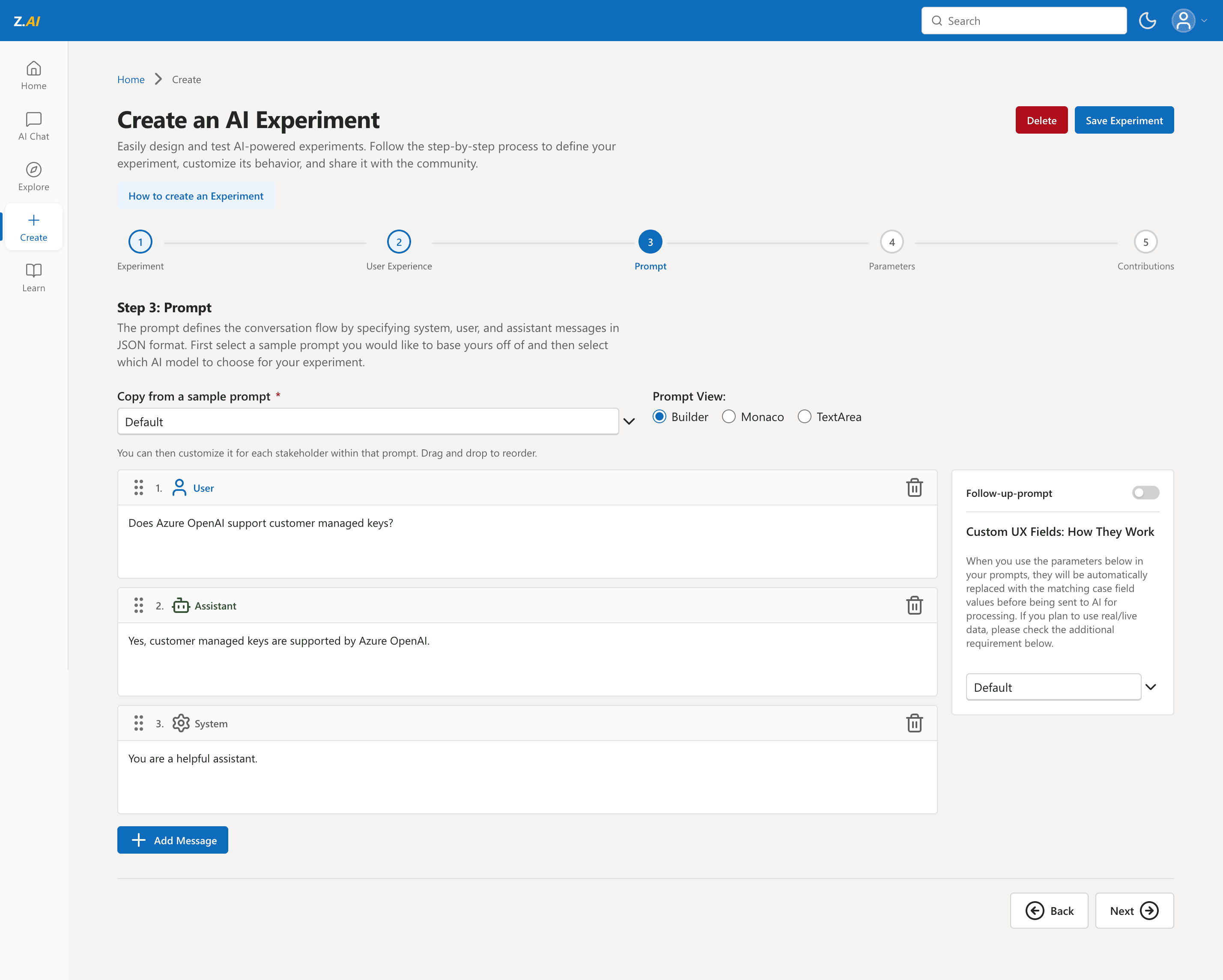
FINAL SOLUTIONS /03
Seamless experiment creation
FINAL SOLUTIONS /03
Seamless experiment creation
Transformed a dense, multi-step process into a streamlined guided wizard, reducing the cognitive load for engineers and cutting setup time significantly.
Transformed a dense, multi-step process into a streamlined guided wizard, reducing the cognitive load for engineers and cutting setup time significantly.

FINAL SOLUTIONS /04
A Centralized Experiment Library
FINAL SOLUTIONS /04
A Centralized Experiment Library
Created a highly scannable hub for engineers to discover, filter, and reuse successful AI experiments from the wider community.
Created a highly scannable hub for engineers to discover, filter, and reuse successful AI experiments from the wider community.

THE PIVOT
From Figma to Functional Code
Midway through the project, an unexpected departure left us without a front-end engineer, putting our shipping timeline at serious risk.
Instead of compromising the design fidelity, I stepped in and used AI coding agents to build the entire front-end myself. This kept us on schedule and allowed the remaining engineers to focus entirely on the complex LLM backend.

Claude Code
Connected Claude to Figma/design system through MCP to convert designs.


Cursor
When I ran out of Claude Code Tokens :)

Figma Make
Explored visual styles, spacing, and layout options quickly.

THE PIVOT
From Figma to Functional Code
Midway through the project, an unexpected departure left us without a front-end engineer, putting our shipping timeline at serious risk. Instead of compromising the design fidelity, I stepped in and used AI coding agents to build the entire front-end myself. This kept us on schedule and allowed the remaining engineers to focus entirely on the complex LLM backend.
Claude Code
Connected Claude to Figma/design system through MCP to convert designs.
Cursor
When I ran out of Claude Code Tokens :)
Figma Make
Explored visual styles, spacing, and layout options quickly.
USER RESEARCH
Who uses Z.AI?
USER RESEARCH
Who uses Z.AI?
Our research revealed two distinct user groups that shaped the design challenge:
Our research revealed two distinct user groups that shaped the design challenge:
Support Engineer (Creator)
Support Engineer (Creator)
→
pushed the limits of Z.AI but struggled with its steep learning curve, often losing time to trial-and-error.
pushed the limits of Z.AI but struggled with its steep learning curve, often losing time to trial-and-error.
Product Manager (Consumer)
Product Manager (Consumer)
→
valued efficiency and quick wins but were frustrated when the platform prioritized flexibility over clarity.
valued efficiency and quick wins but were frustrated when the platform prioritized flexibility over clarity.
The UX of a survey
The UX of a survey
I collaborated with my UX manager to design a survey exploring user behaviors and pain points. Through multiple rounds of refinement, we focused on asking fewer, higher-impact questions to maximize response rates and data quality.
I collaborated with my UX manager to design a survey exploring user behaviors and pain points. Through multiple rounds of refinement, we focused on asking fewer, higher-impact questions to maximize response rates and data quality.
Key findings:
60% manually verify AI outputs, revealing users don't trust the platform's results
60% manually verify AI outputs, revealing users don't trust the platform's results
56% needed 4+ experiments before mastering the creation process
56% needed 4+ experiments before mastering the creation process
The platform needs both transparency improvements (to build trust) and workflow simplification (to reduce learning curve)
The platform needs both transparency improvements (to build trust) and workflow simplification (to reduce learning curve)
Actually talking to users
Actually talking to users
What we discovered: One platform, two completely different user needs
What we discovered: One platform, two completely different user needs
"The UI is the biggest pain point. Productivity is lost due to poor search functionality and lack of documentation."
"The UI is the biggest pain point. Productivity is lost due to poor search functionality and lack of documentation."
"I don't want to build experiments. I just want to find one that solves my problem."
"I don't want to build experiments. I just want to find one that solves my problem."
"This looks fine, but I have no idea what 'temperature value' means. Should I change it?"
"This looks fine, but I have no idea what 'temperature value' means. Should I change it?"
Consumer seeking quick solutions
Creator struggling with platform complexity
Creator struggling with platform complexity
Former User who abandonded the platform
Why did we lose our users?
The platform was designed for technical Creators, but 60% of users were Consumers who needed simplicity, not flexibility. This mismatch drove users away.
The platform was designed for technical Creators, but 60% of users were Consumers who needed simplicity, not flexibility. This mismatch drove users away.
OPPORTUNITIES
Refining through feedback
After creating high-fidelity prototypes, I met with my UX manager and users to review the designs. His feedback was very valuable and helped shape the final direction:
After creating high-fidelity prototypes, I met with my UX manager and users to review the designs. His feedback was very valuable and helped shape the final direction:
Experiment creation wasn't intuitive — Users couldn't tell what each step was for or if steps were required
AI chat felt disconnected — The small text box needed to become an immersive, full-page experience
Language was too technical — Engineering terms like "temperature" confused non-technical users
Guidance was missing — No onboarding or contextual help to orient new users
I guided my team to four main areas for redesign
I guided my team to four main areas for redesign
User research revealed four critical barriers. I translated each into a design solution:
User research revealed four critical barriers. I translated each into a design solution:
🏠 Homepage & Navigation
Simplified navigation from 11 tabs to 5 core actions to reduce decision paralysis
🏠 Homepage & Navigation
Simplified navigation from 11 tabs to 5 core actions to reduce decision paralysis
🏠 Homepage & Navigation
Simplified navigation from 11 tabs to 5 core actions to reduce decision paralysis
🔬 Experiment Creation
Reduced creation from 8 confusing steps to 5 guided steps with clear progress indicators
🔬 Experiment Creation
Reduced creation from 8 confusing steps to 5 guided steps with clear progress indicators
🔬 Experiment Creation
Reduced creation from 8 confusing steps to 5 guided steps with clear progress indicators
🔍 Search & Discovery
Introduced category-based organization and smarter filtering to help users find experiments faster
🔍 Search & Discovery
Introduced category-based organization and smarter filtering to help users find experiments faster
🔍 Search & Discovery
Introduced category-based organization and smarter filtering to help users find experiments faster
📚 User Guidance
Added contextual help, tooltips, and onboarding to guide users through complex workflows
📚 User Guidance
Added contextual help, tooltips, and onboarding to guide users through complex workflows
📚 User Guidance
Added contextual help, tooltips, and onboarding to guide users through complex workflows
DESIGN DECISIONS
Multiple rounds of iteration and feedback
Home
DESIGN DECISIONS
Multiple rounds of iteration and feedback
Home
BEFORE

🚫 11-item sidebar + text-heavy layout cause cognitive overload.
→
→
V1

🚫 Heavy color blocking distracts from core actions.
Create
Create
BEFORE

🚫 Dense tab structure lacks a guided user flow.
→
→
V1

🚫 Cluttered vertical lists increase cognitive load.
FINAL
AI Chat
AI Chat
BEFORE

🚫 Overloaded users with text and technical terms like “temperature” and “top-p value.”
→
→
V1

🚫 Flat chat input and clunky logo lack the immersive feel of modern AI tools.
FINAL
Learn
Learn + FAQ
BEFORE

🚫 Text-heavy and overwhelming, burying critical guidance in long paragraphs.
→
→
V1

🚫 Equal visual weight across all cards fails to prioritize key resources.
FINAL

Capstone showcase
For the Informatics Capstone showcase, we set up a display with a poster, prototype walkthrough video, and a video prototype. I designed the poster layout, filmed the walkthrough, helped create the prototype video, and presented the features I led along with the ideation phase. Our design received positive feedback, and we had great conversations with judges and guests throughout the event.
For the Informatics Capstone showcase, we set up a display with a poster, prototype walkthrough video, and a video prototype. I designed the poster layout, filmed the walkthrough, helped create the prototype video, and presented the features I led along with the ideation phase. Our design received positive feedback, and we had great conversations with judges and guests throughout the event.


Next Project
Streamlining the reimbursement processes in Quickbooks boosting efficiency for small businesses


